Sign Up
School Account Sign Up
Lesson ID: 10059
What if you have tons of numbers to compare, like how many birds you've seen each day for a week. Wouldn't it be nice to have an easy way to show your results? Learn how by using fancy pictographs!


What Is a Pictograph?
Imagine you asked your friends, “What is your favorite kind of music?”
You could write the answers as a list.
That works, but it is not very exciting. It also takes a little time to compare the numbers.
A pictograph is a graph that uses pictures or symbols to show data. Data means information you collect, such as answers to a question or numbers you count.
Instead of showing every number with only digits, a pictograph uses pictures to make the information easier to see and compare.
Look at the Pictograph Example found under Downloadable Resources in the right-hand sidebar. Print a copy to use during the lesson.
Parts of a Pictograph
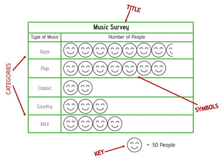
A pictograph has a few important parts.
The title tells what the pictograph is about.
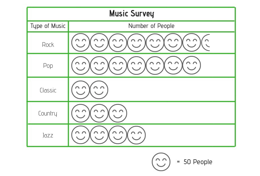
In the Pictograph Example, the title is Music Survey. That tells you the graph shows information about music.
The categories show the groups being compared.
In the Pictograph Example, the categories are types of music: rock, pop, classic, country, and jazz.
The symbols are the pictures used to show the data.
In the Pictograph Example, the symbols are smiley faces.
The key tells what each symbol stands for.
This is the part you must check before you start counting. In the Pictograph Example, one smiley face equals 50 people. That means each full smiley face is worth 50 people, not just 1 person.
How to Read a Pictograph
To read a pictograph, follow these steps.
Ask yourself, “What is this pictograph about?”
Ask yourself, “What groups am I comparing?”
Ask yourself, “How much is each picture worth?”
Do not forget to use the key. Pictographs are sneaky little math ninjas that way.
Try It With the Pictograph Example
Look at the row for Classic music.
There are 2 smiley faces.
The key says 1 smiley face equals 50 people.
So, 2 smiley faces equals 100 people.
That means 100 people chose Classic music.
Now look at the row for Country music.
There are 3 smiley faces.
Each smiley face equals 50 people.
So, 3 smiley faces equals 150 people.
That means 150 people chose Country music.
What About Half Symbols?
Sometimes a pictograph uses part of a symbol.
In the Pictograph Example, the rock row has 7 full smiley faces and 1 half smiley face.
Each full smiley face equals 50 people.
A half smiley face equals half of 50.
Half of 50 is 25.
So, rock music has:
7 full smiley faces = 350 people
1 half smiley face = 25 people
350 + 25 = 375 people
That means 375 people chose Rock music.

Why Use a Pictograph?
Pictographs help you see information quickly.
You can use a pictograph to find which category has the most, which category has the least, how much more one category has than another, and how many there are in all.
Look again at the Pictograph Example.
Rock had the most because it has the most symbols.
Classic had the fewest because it has the fewest symbols.
Now compare Pop and Jazz.
Pop has 7 smiley faces.
Jazz has 4 smiley faces.
That is a difference of 3 smiley faces.
Each smiley face equals 50 people.
3 smiley faces equals 150 people.
So, 150 more people chose pop than jazz.
Your Turn
Use the Pictograph Example to answer these questions.

Nice work!
Continue to the Got It? section to practice reading and making pictographs.

Supplies
Suggested Reading


