Sign Up
School Account Sign Up
Contributor: Marlene Vogel. Lesson ID: 10101
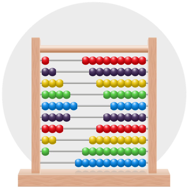
If you're comparing scores for several teams or something really important, like how many of each color of candy is in your bowl, you should use graphs! Learn how to chart your graph course today!


You want to compare the number of building bricks you own with the number your friend owns. However, you want to compare them according to their colors.
Look at the Favorite Gifts Bar Graph in the Downloadable Resources section on the right-hand sidebar.
Yes! It is a bar graph showing which gifts people like the most.
Large amounts of information can be represented in tables and graphs.
To get started, copy the following vocabulary words down into your notebook. Then, add the definitions you find at Merriam-Webster.
| data | visually | table | bar graph | X-axis | |
| horizontal | vertical | key | pictograph | Y-axis |
In this lesson, you will create a bar graph and a pictograph. The information you need to create each graph is below.
BAR GRAPH
Bar graphs represent data or information visually. They are a great way to communicate information to others without speaking.
When creating a bar graph, you represent the data in columns or bars.


According to the data, the company has sold 630 Guitars, 720 Trumpets, 405 Drums, 540 Saxophones, and 405 Pianos. It is your job to represent those numbers on your graph!

Your graph should look like the example below.

PICTOGRAPH
A pictograph resembles a bar graph. One difference is that you use pictures to display the data instead of just colors.
The following activity will help you learn how to create a pictograph to help you communicate data.
In keeping with the Music theme, practice representing data from a survey about our favorite kinds of music.

The rows in that column are blank. That is where we will draw our pictures to represent our data.
Here is the data.

As you can see, the data is in the thousands. You could not draw 3,750 pictures in Rock Row's Number of People column to represent everyone who likes rock music the most.
You have to decide what type of picture you want to represent ALL the data and how many people just one of those pictures represents.
Here is a possibility: A simple (-_-) can be used in each row to represent the data for each type of music. One decision was made!
Not one person! Say that one (-_-) = 500 people. That way, you do not have to draw too many to represent our data!
Put your multiplication skills to good use. If you did your multiplication correctly, you figured out that 7 (-_-) equals 3,500 people. However, you need to represent 3,750 people.
Exactly! Only draw 1/2 of a (-_-). Now, your graph should look like this.


Head to the Got It? section to keep graphing!

Supplies